Babergh and Mid Suffolk logo rated one of the worst in the UK
By Derek Davis 25th Nov 2021
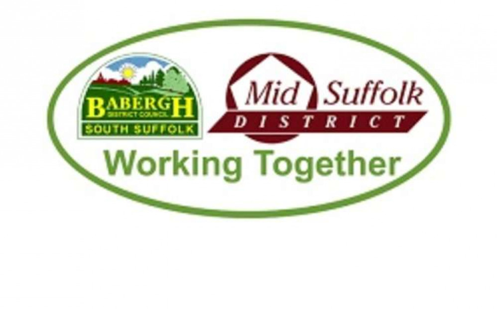

Babergh and Mid Suffolk's logo has been listed as one of the worst in the country.
Freelance writer and graphic designer Robin Wilde rated Babergh district council and its neighbour's logo as seventh bottom among the 399, which represent all of the UK's local authorities.
Babergh, which serves the Shotley peninsula, was rated the worst in the Suffolk coming in 392nd, and Mr Wilde wrote of its logo: "This is confusing as it has clearly been produced digitally, but by someone with absolutely no artistic sense.
"The lurid colours, massively busy contents and low-resolution system fonts might work for an adventure game from 1991 but not for an organisation in control of services for 92,000 people."
A spokesperson for Babergh and Mid Suffolk District Councils said: "We are very proud of all that our districts and towns have to offer. It is disappointing to hear East Anglia described as 'backwards' and negative comments about Stowmarket as we believe that both Babergh and Mid Suffolk are fantastic places to live, work and visit.
"To be honest, we're more interested in supporting our residents and communities – and put far greater stock in winning bronze in the Council of the Year category of the iESE Public Sector Transformation Awards this year for our work through the pandemic and beyond."
Suffolk County Council's logo was ranked by Mr Wilde as the 222nd best in the UK.
The critic said: "The failure to curve the back corner on the extruded block here hurts me inside.
"It would have been so easy! And crucially it harms what is otherwise a standard mid-tier logo."
East Suffolk District Council was praised highly for its new, stylish looking logo and colour scheme of greens, blues and yellows., as it came in as the eighth best.
Mr Wilde wrote: "This council is very new, as is its logo, which does it no harm, but it's still a remarkably nice approach.
"The combination of rural farmland and beautiful seaside is communicated well alongside the idea of forward progress."
West Suffolk was rated 209th, while Ipswich Borough Council came in 113th, second best of the Suffolk offerings, with praise going to its simple design, single colour and 'weighty font choice'.
Coming in first place and crowned best local authority logo in the UK was that of Bedford Borough Council. Mr Wilde wrote: "Ask me for a council logo that can reproduce at scale across your bin lorries and also strike fear into your enemies carried aloft on a banner into battle, and I'll show you Bedford."
Very last on the list was Allerdale Borough Council, which Mr Wilde likens to the Windows 95 desktop background.
CHECK OUT OUR Jobs Section HERE!
shotleypeninsula vacancies updated hourly!
Click here to see more: shotleypeninsula jobs
Share:


